The project is password protected
Trane Supply is an e-commerce platform that distributes Trane HVAC part and equipments.
Trane Supply

Story worth talking about
Trane Supply was looking for a company pitch that could help them create the best experience in commerce while also retaining there existing flow.
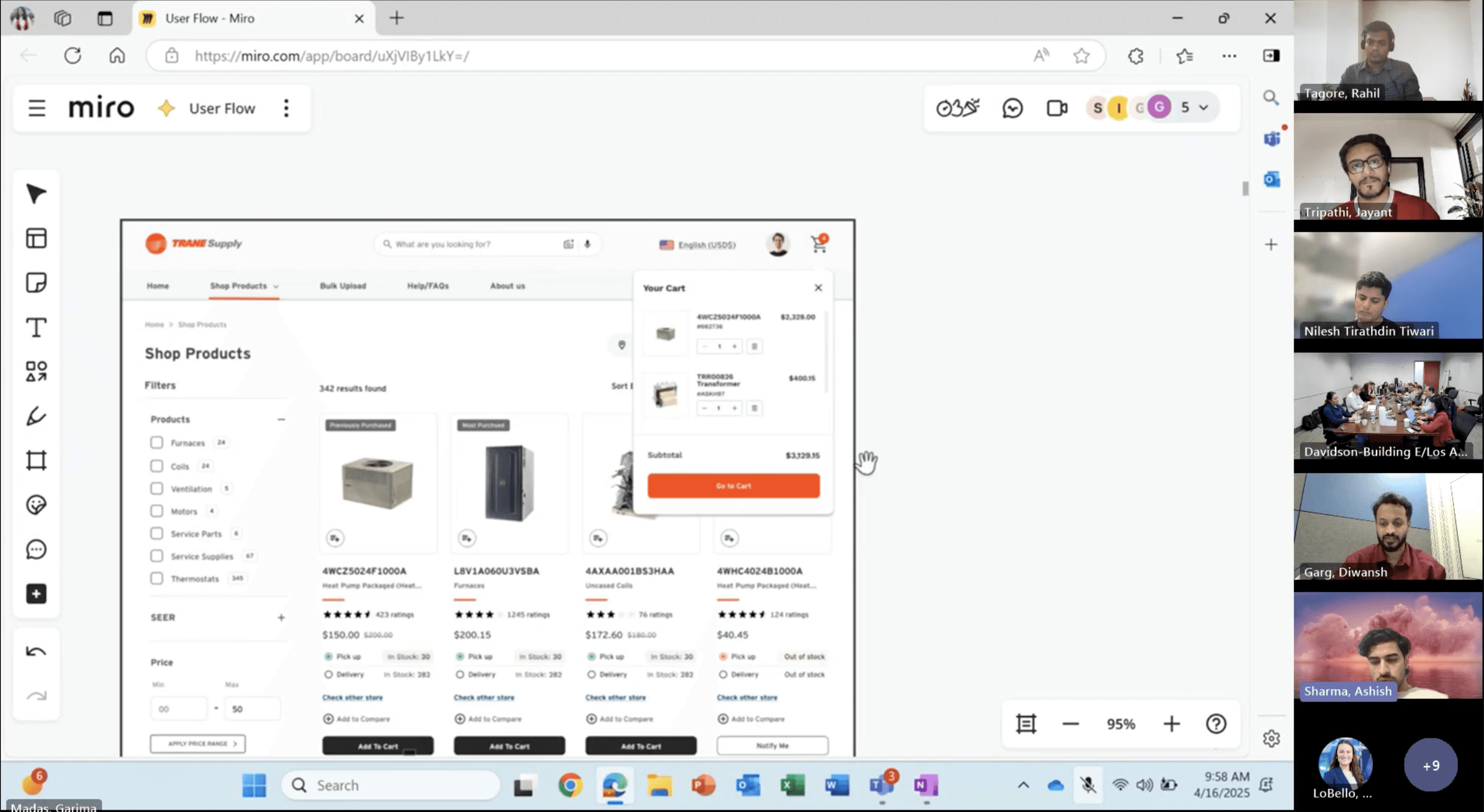
We worked day and night to create to build a working prototype and sell the best in industry experience which included, and improved PLP and PDP to show product availability, ability to compare products, a 3d render visual of part images, Ability to create joblist, saving cart, many more.
And they loved it. and we started working together.
Timeline
Pitch: Feb 2025
Phase 1: April 2025 - August 2025
Phase 2: September 2025 - February 2026
Phase 3: In talks
Panel Size

Ashish Sharma
UX Designer

Scrum Master
1 Member
Jayant Tripathi
Senior UX Designer
Product Team
3 Members
Taxonomy Team
4 Members
Pitch Research Approach
Competitive UX Audit
Rapid UX Synthesis & Prototyping
Collaboration & Delivery
[Approach 1: Competitive UX Audit]
We began by auditing leading platforms selling Trane parts, starting with Parts Town. This competitive UX review helped us analyze navigation patterns, search functionality, product filtering, and overall user experience—uncovering best practices to inform our own design strategy.
With only one week to deliver a functional prototype, we adopted a "best-in-class synthesis" approach:
Feature
Inspired By
User Benefit
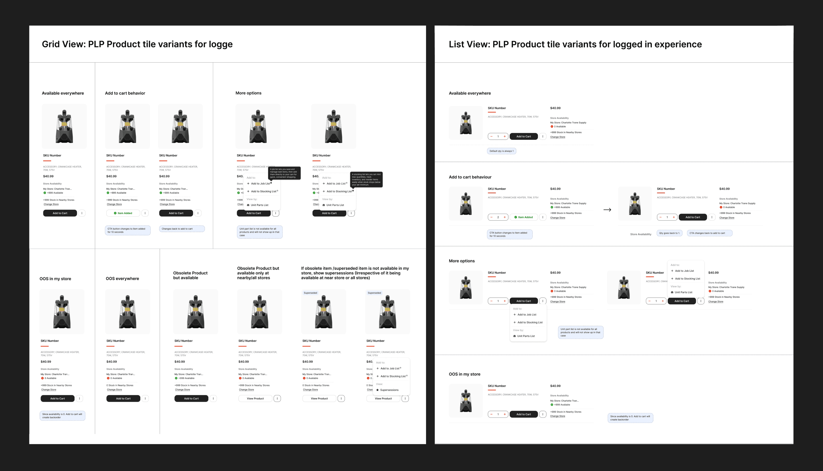
In-stock on PLP & PDP
Parts Town
Instant availability clarity
PDP: Recommendations + Reviews
Competitive audit
Builds trust, aids decision-making
Training banner on PDP
Industry best practice
Upskills users, reduces support load
Mini cart + Bulk order flow
Pro e-commerce UX
Faster multi-item purchases
Detailed cart line items
Transparency patterns
Reduces errors, prevents abandonment
[Approach 2: Collaboration & Delivery]
Partnered closely with the business team during late-night sessions to align visuals with Trane brand guidelines.
Ensured business-critical information was legible, scannable, and visually compelling in the final PPT.
Delivered a clickable, high-fidelity prototype + branded presentation deck on time.

Design Approach
Foundational Style Guide
Introduced UX Improvements
Reviewed Dev handoff
Ensured Multilayer Approval
[Approach 1: Structured foundation under Salesforce constraints]
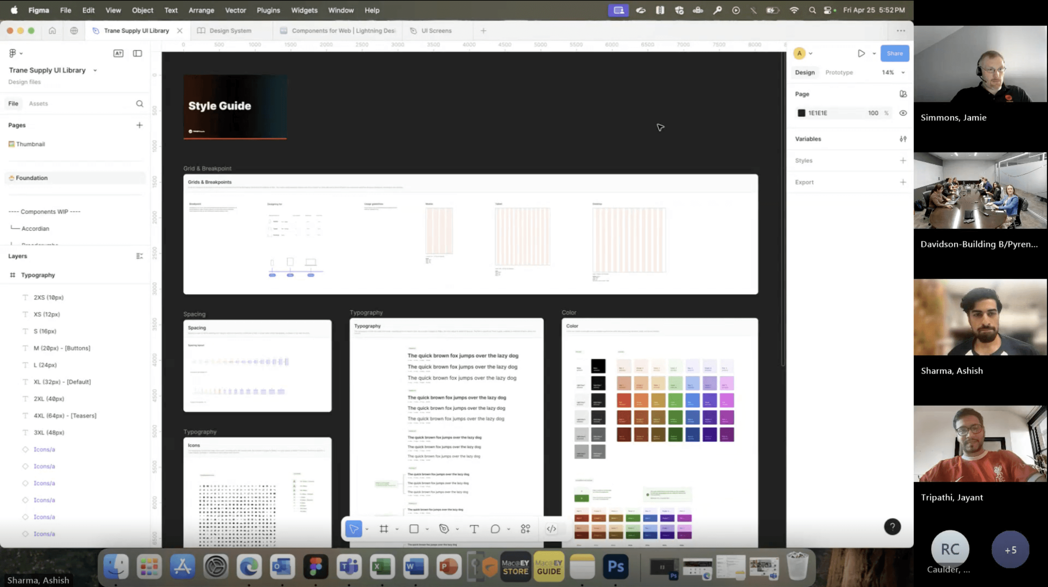
To move fast without breaking Salesforce, I created a foundational style guide using Trane’s existing assets—defining typography, colors, grids, and icons upfront.
This helped prioritize high-impact UX pages, reduce Salesforce disruptions, and keep design iterations aligned under tight timelines.
[Approach 2: Cross-functional validation and UX uplift]
I worked through a multi-layer approval workflow—aligning early with developers, client design and marketing teams, product owners, and e-commerce leadership to validate feasibility and real user flows.
This resulted in targeted UX improvements including a Mini Cart, improved PLP filters, modernized header and footer, new marketing banner types, and clearer account-creation flows—while staying within Salesforce limitations.
Challenges & Learnings Ph - 1
[Problem 1]
"Designing without an existing company-wide design system?"
Solution: We got WIP client assets which included buttons, fonts, colors and icons. To get started we needed a fundamental design system that took us 3 days to build over the given assets. We ensured consistency by adding required components like, header, input fields, grid system and defining typography. on the 4th day we connected with client and got dev and client approval to avoid mid-project rework.

[Problem 2]
"How to enhance UX while keeping the existing process flows memorable for the user?"
Solution: Since we got to know that only 3% of the traffic was utilising the features like saved cart, job list and stocking list. We prioritized visual polishes over structural changes in these pages, using client feedback loops to align without extending timelines.
[Problem 3]
"How to manage cross-sprint dependencies when later pages relied on PLP/PDP decisions?"
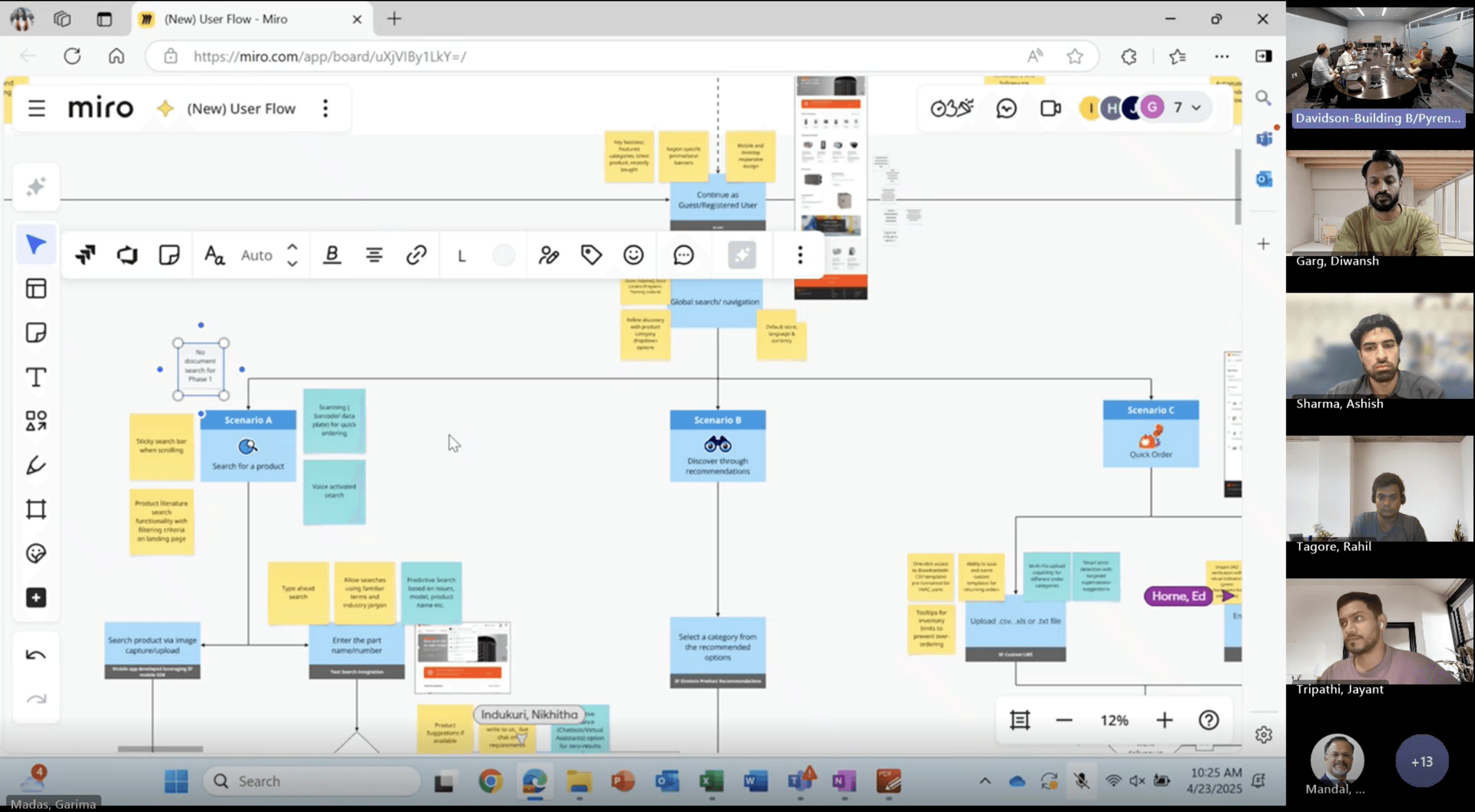
Solution: The PLP needed to have a new grid view to have more items in a one fold of screen. In order to make this work we realised the need for product availability, ability switch fulfilment store for the each item and adding item to cart, we worked two sprints ahead of devs, stretching Sprint 2 for PLP/PDP insights that informed Sprint 3's My Cart, leveraging buffers effectively.
[Problem 4]
"How to capture complex HVAC-specific rules around inventory, quoting, and roles?"
Solution: Ran short client calls with live Figma files. Noted stock rules, quote details, and permissions directly on screens and got sign-off before moving forward.
[Problem 5]
"How to achieve contemporary UX within Salesforce Commerce Cloud constraints?"
Solution: Opted for CSS-based micro-interactions over heavy JS. Put most effort into filters, mini-cart, and help sections while keeping dev work fast.
Challenges & Learnings Ph - 2
[Problem 1]
"How would split orders impact the end-to-end journey?"
Solution: We mapped the split-order impact across PLP, PDP, Cart, Checkout, and Email notifications.
Three fulfillment methods were introduced—Will Call (pickup), Direct Delivery (third-party), and Standard Delivery—with clear visual separation, pricing clarity, and fulfillment-specific messaging to avoid user confusion across touchpoints.
[Problem 2]
"How do we design around third-party delivery limitations?"
Solution: Curri delivery had strict constraints—50-mile radius, limited vehicle options, no loading/unloading, and no hazard or dimension data.
We designed guardrails and eligibility messaging, surfaced limitations early, and reduced failed selections by helping users understand when Direct Delivery was actually viable before committing.
[Problem 3]
"How do we keep unit parts list expereince minimal yet informative at scale?"
Solution: We redesigned the Unit Parts List to support 3D views, sub-assembly exploration, and superseded items, while respecting data-loading limitations.
Progressive disclosure was used to balance performance with clarity, ensuring users could find the right part without overwhelming the interface.
[Problem 4]
"How do we reduce friction in checkout without losing critical info?"
Solution: The checkout was restructured into three clear sections, with pre-filled data, optional fields clearly marked, and strong visual focus on the payment step—reducing cognitive load and speeding up completion.
[Problem 4]
"How can we introduce an app-like mobile experience within Salesforce Publisher’s platform limitations?"
Solution: Despite bottom-navigation constraints, we introduced a mobile-friendly category experience and app-optimized cart navigation.
Key interactions were simplified to feel native while staying within Salesforce Publisher’s development limits.
Interested in working together?
© Assembled with pixels by Ashish. Last updated Jan 2026